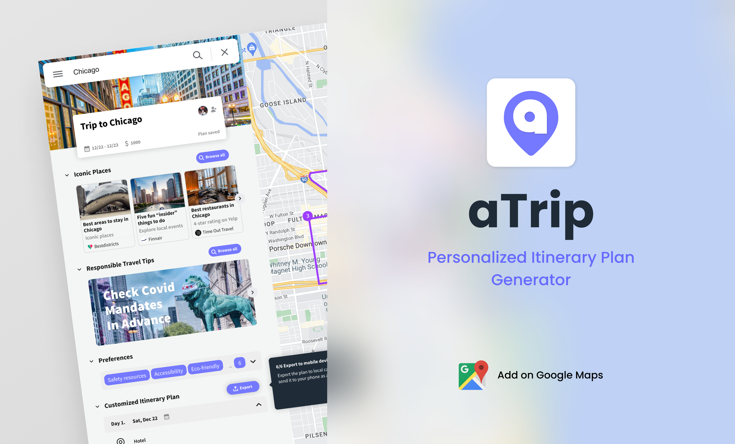
aTrip an integrated and streamlined travel planning tool. From shared experience of spending copious amounts of time and energy on researching travel experiences, we focus on the issue of young adults between the ages of 18-28 feeling prepared and well-informed enough to act as responsible travelers before, upon, and after reaching their destination of choice.
Tools
Figma, Adobe Suite, Miro
My Role(s)
Project Manager, Research Lead, Prototyping, Backend Design
Duration
Aug 2022 - Dec 2022
Team
Mix of 4 UX Designers and Researchers
The Problem
Travel is the best option for many people to relax during the holidays, especially for younger generations and GenZ populations. According to the latest 2021 travel data, GenZ spends a significant portion of the nation's travel spending and have the longest average travel time per year (Travel Statistics by Age Group 2020-2021). For this population, while everyone has a different perspective on what is most important in travel, in general most of them are concerned about the cost of travel, so they plan their trips in advance to get the best experience with limited spending.
Our design question: How might we help young adults feel more comfortable for the duration of their travel experience(s)?
Goals
Understand the user experience behind the process of preparing for and engaging in travel
Identify discoverable gaps and areas of improvement within this process, and
Develop a high-fidelity interactable prototype that effectively conveys the content and functionality of the product.
Our Proposal and process
We propose aTrip, a Google Maps plugin created to help target users to enhance their experience comprehensively by forming collaborative travel itineraries, receiving an auto-generated travel plan, and possessing the ability to tweak that plan whenever and wherever they want. With our product, we hope users can explore most aspects of travel successfully.
Research phase
Study Overview
In order to formulate our study, we extrapolated key questions from our goals that we sought to answer through various research methods. These questions included, but were not limited to:
How do individuals’ concerns and needs change throughout their travel experiences?
Where do existing products miss the mark on addressing unmet needs of our target users?
How do potential users’ travel preferences/motivations compare and contrast to each other?
How might we help young adults feel more comfortable before, during, and after their travel experience(s)?
Competitive Analysis and Persona Findings
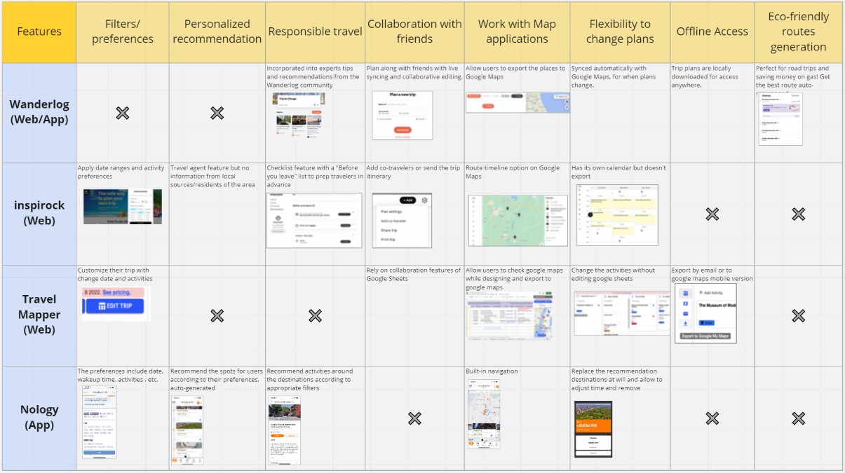
Once the scope of the project was determined, we analyzed four competing products that would inform our research process and key functionalities to distinguish aTrip within this space. These competitors existed in the areas of travel planning, itinerary generation, and navigation to align closest with our product goals. From the analysis, we obtained some key takeaways. Across the board, competitors lacked functionality in both:
Creating personalized recommendations for the user
Including mobile compatibility with the desktop application.
We wanted to generate the most customized, relevant suggestions for activities, food, and events during the individual’s travel; this aspect was targeted through the creation of filter selection and turning on certain options per the user’s liking. Mobile compatibility also became integrated into our product as a key component to account for all aspects of the user’s travel, before, during, and after their trip.
User data from preliminary research, informal accounts, and formal methods (survey, interviews) also enabled us to establish a primary persona for our product. This persona has supported our subsequent interface design and has guided our understanding throughout the research and development process of aTrip. Therefore, our target users were established as young people from 18 to 28 years old whose main motivation is to enhance their travel experience comprehensively.
Survey and Findings
As one approach to our qualitative research methods within this study, we distributed surveys to approximately 50 participants to glean information about trip planning preferences, attitudes, and behaviors. We filtered responses which were not applicable to our target user age range (18-28 years old) and obtained the following insights:
Across the board, all potential users employed Google Maps as their primary travel tool.
Users liked to perform research prior to travel, and remained well-informed about the most up-to-date information about their destination of choice.
User preferences and priorities varied heavily when provided with some travel metrics (e.g., cost, safety, transportation) and did not exist in a one-size-fits all configuration.
The concept of a plugin tool for travel was heavily appealing to users, as many did not want to download a new platform or familiarize themselves with a novel interface, especially since most users indicated they experienced infrequent (once a year to a few times a year) bouts of travel annually. This finding could most aptly be demonstrated with the following participant’s quote:
“I would prefer the Google map plugin solution because it aligns with my current flow. I like searching for the place I plan to go with Google Maps, and it would be convenient to see if it is safe to travel on Google Maps at the same time.”
The above findings provided a great deal of user perspective into formulating our product and its format. We thus sought to create an integrated tool which did not require an entire product but instead a plugin of an already existing interface (Google Maps, which would ensure the highest level of accessibility to our target users). We also wanted to capitalize on diverse needs of our users by allowing them to customize their travel needs such as popular areas, transportation modes, and even accessibility of spaces.
Additionally, we decided to integrate holistic “responsible travel tips” as a facet of our design that would help users become responsible travelers in terms of awareness regarding the cultures, customs, policies, and infrastructure of the area. Allowing users a consolidated access to all relevant resources about their destination of choice in a streamlined format could help ease any concerns or anxieties associated with being an unprepared traveler.
interview and Findings
Another aspect of the study was to conduct 2, in-depth user interviews to solidify our understanding of the user journey and users’ more subjective ideas about our concept’s use/proposed functionality. From conducting these interviews and asking users questions about their recent travel experiences, travel planning/product experience, and our concept, we learned the following:
A mobile version (in addition to our proposed desktop concept) would be essential for users to receive comprehensive assistance that addressed all aspects of their travel. In participants' past travel experiences, they usually did not follow their planned itineraries 100 percent of the time, so mobile applications could be used to make changes to their itineraries along the way and enable a modicum of flexibility.
Users would need the option to collaborate with others during planning, at least asking advice from their friends/families.
Users wanted to be aware of the local culture and certain trip preparations specific to the area in advance. This would be essential to our users in developing the safest and most comprehensive travel plan that could prevent a variety of inconveniences during the actual trip. For instance, we learned from an interviewee that “in Cuba, some stores don't accept dollars and they have to exchange money and the exchange rate is not standardized…” This is a tip that could easily have been incorporated into an existing travel platform so that they would have been prepared for the exchange rate prior to traveling to Cuba.
Users would most likely need to change their existing travel plans during their trip. Making itinerary adjustments that accounted for unforeseen events, such as temporary closure of restaurants or weather conditions, could greatly aid the user both during and after their travel. This would also be helpful for users and groups that are not fully committed to their itineraries, since “during the trip, we might change our mind about places to visit in the next few days.”
Based on these key findings, we felt it was necessary to combine the web and mobile versions into a multi-device platform that could appeal to all aspects of the user journey, not just trip preparation. We also decided to make some iterations of the existing features, such as accounting for budget and expenses, as well as eco-friendly travel.
design phase
transition from research
We combined our study findings to construct the appropriate information architecture (left) and product features that could address user needs in all aspects of the overall travel experience that we were exploring. We organized each feature within an information hierarchy; this acted as the skeleton for our product, consisting of a preference section (user customization), a recommendations area (user awareness), and exporting options (mobile compatibility). After we added the details for each main feature, our interface design could become more reachable, intuitive, and understandable to users.
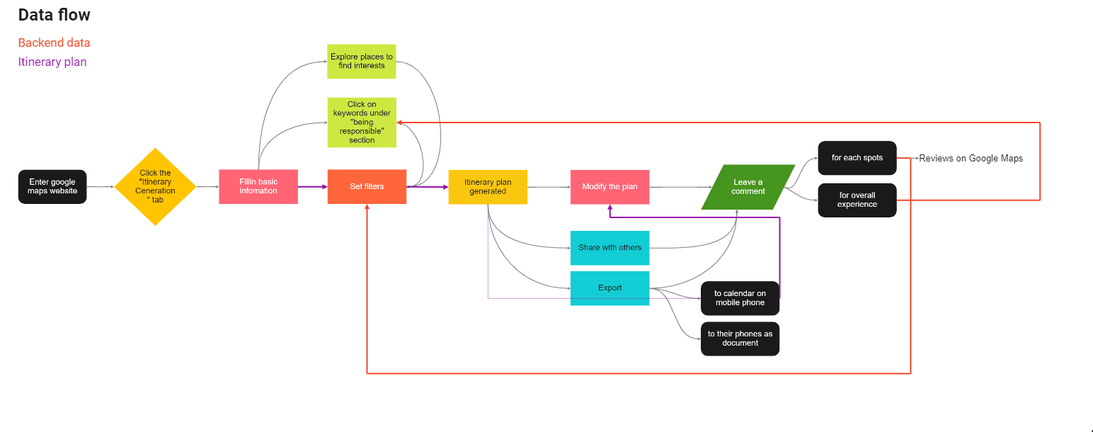
Concurrently, we also developed a storyboard which helped us contextualize the experience of using our product from the user perspective. We translated this visualization into a user journey (below) and tried to form a good closed loop which could inform the structure and flow of the application prior to actually designing individual features and screens.
initial ideation
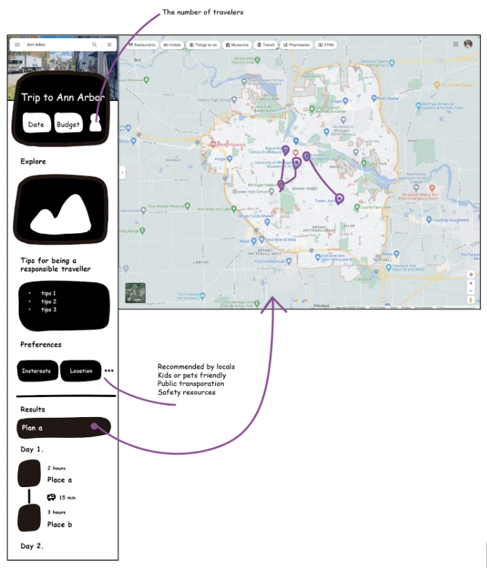
We sketched out an itinerary generator plugin for Google Maps that generates travel plans based on people’s preferences and budgets. Individuals can narrow down the recommended plans generated by the algorithm through inputting budgets, days for travel, and numbers of travelers. Furthermore, to address safety concerns holistically which is the top priority for planning a trip, users are allowed to not only choose areas populated by locals rather than tourists, shops close to public transportation, and places with abundant safety resources but also provide some tips for people to be responsible travelers in terms of cultural, behavioral, and basic infrastructure differences.
After selecting the area preferences, multiple travel plans along with the routes would be generated automatically and visualized on the map while hovering over a specific plan. In that case, users are able to choose one of the plans and synchronize the plan to their local calendars and note-taking applications, which is convenient to look for and receive notifications later when utilizing their mobile device during travel. As such, with the concept variations, the third option (web plugin + mobile features) was chosen.
branding
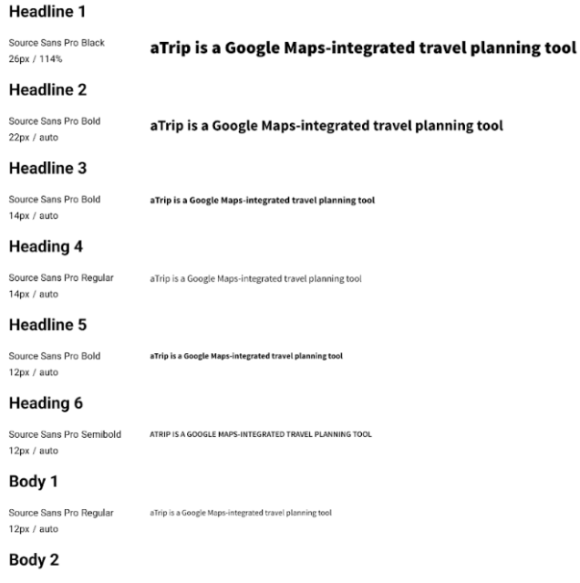
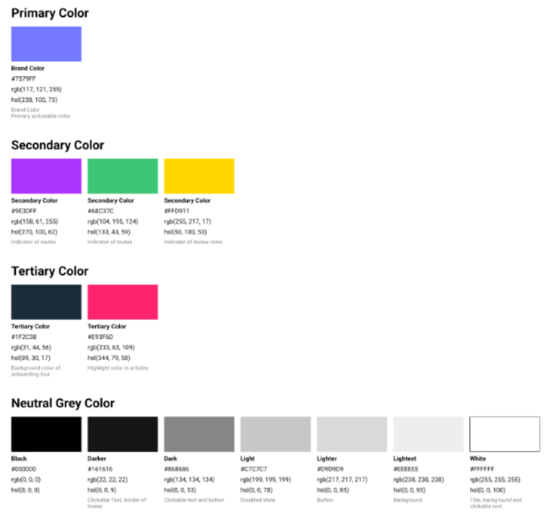
Based on all key findings regarding users frustrations and opportunities from the comprehensive research, we narrowed down the functions that will be achieved through this product and initiated the design ideation as well as iteration accordingly. Starting with naming our product and sketches about the logo ideas, we created a style guideline for our brand to present the product with consistent visual styles. Furthermore, according to the information architecture and the diagram of user flow, we devised onboarding bubbles to guide users through the key features and more importantly constructed a design library for user interfaces in a way that all team members could contribute their design elements to the package which is the foundation of further design activities.
data structure and backend flow
test phase
Study Type: Usability Test of the High-Fidelity Interactive Prototype
Number of participants: 5 (chosen from survey)
Setting: All tests were conducted via Zoom while adhering to COVID-19 guidelines
During the testing, participants used a think-aloud protocol to complete tasks related to each feature from onboarding/tutorial, collaboration through itinerary sharing, education about responsible travel tips and exploration in an area, customized itinerary plans based on filtered user preferences and flexibility to adjust the generated itinerary while on the trip to portability to mobile devices during travel.
Findings
Common findings related to the feature of responsible travel tips. Specifically, participants are confused about the definition of responsible travel and the necessity of this section. One participant shared:
“I like your idea of a personalized itinerary plan. But I was curious about the section called “tips”. Is it the same as “exploration”?” –Participant A
Throughout the desirable usability testing, participants expressed that the interface was well-organized, and intuitive to interact with. After analyzing the data, we learned that most confusion revolved around the semantic of section’s name and design elements. One participant shared:
“I can’t find a way to export the itinerary plan to the apple calendar in my smartphone.'' –Participant B
Design Changes
Therefore we optimized our interfaces in three areas.
Users are confused about the possible pages triggered by the Export button, especially when they only want to find a way to send the plan to local calendars. It turns out this design element is not clear enough. As a result, we combined the calendar icon and plus icon to replace the old one in order to reduce ambiguity (left).
We added a button to the image under "responsible travel tips" that indicates this is a clickable link to other subpages (center).
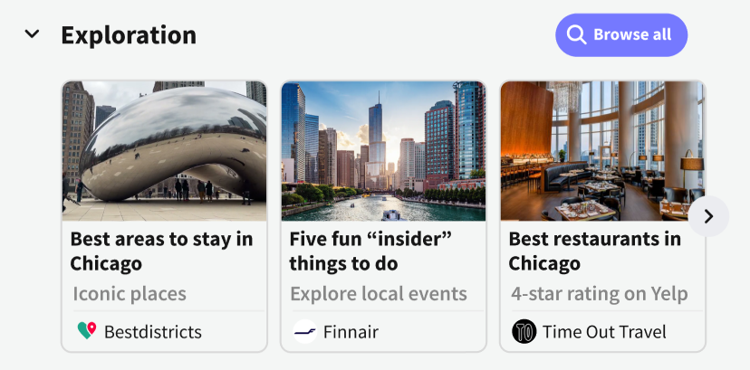
To make sense of the section name according to its content, we renamed the iconic places section to Exploration since the information there refers to travel guides rather than a list of places (right).
Product Features and Rationale
Feature: Preparation
At the beginning of the app tour (left), users are asked to input the basic information about the expected trip including travel dates, budgets, and numbers of friends to travel together. In order to achieve the collaboration feature, there is an icon dedicated to inviting others to co-work on the plan-making. Besides, we figured out the user interface in the state of collaboration by showing the position of collaborators on the page in real-time.
Rationale
For the purpose of assisting people to control the expenses under their budgets, we needed to confirm dates for travel and the number of people who could split the cost of activities (center).
Based on the findings from user interviews, our target audiences like to share their work with others to obtain higher efficiency. In this case, a dedicated design element should be added to our main page to allow users to send invitations to their tripmates (right).
Feature: Education
On the homepage, we listed the travel articles to help users understand the area and tips to be a responsible traveler being respectful to local rules and customs.
Rationale
Through the competitive analysis, it was found one of the common features is travel guide articles which provide users a chance to have a glimpse of the local communities through looking through the recommendations from reliable organizations or people with a bunch of travel experience.
Feature: Customization
The core feature of aTrip is customization, which allows users to set filters based on their preferences to generate a personalized plan. We gathered all elements that users care most about when planning a trip to the list of preferences such as eco-friendly, public transportation, local recommendations, safety resources, accessibility, parking, internet access, and pet-friendly (center). When a specific plan comes out, people are able to modify each auto-generated spot and add any spots as the start or end point to produce a complete route (right).
Rationale
In regards to customization, a pivotal finding from the competitive analysis is that there are no products on the market that provide a truly customized service for users to plan their trips which forces users to spend a lot of time and energy gathering all materials and sorting places.
An auto-generated itinerary plan driven by algorithms cannot be perfect for everyone, even though it’s based on user-input information as filters. Therefore, making the plan easy to be modified is necessary to provide a user-friendly product.
Feature: Portability
In accordance with users' habits, there is a dedicated button that directs users to export plans to local calendars or send them to their mobile phones directly as a PDF through a pop-up notification.
Rationale
During the in-depth user interviews, we found that most users use the mobile version of Google Maps to navigate through places during travel. And sometimes they have to look through documents to follow their plans when traveling to a place without internet access.
next steps
Further Research
Our current research, though informative, could definitely be expanded upon as our product is scaled and refined. We will therefore conduct additional research to address the following key questions:
What aspects of our design do users find most versus least helpful in their overall travel experience?
What does the retention rate of first-time users experiencing aTrip look like?
How can our application become even more engaging, effective, and/or refined towards our target users? What do they think of the layout and aesthetics of the interface?
What are potential add-ons or upgrades that we could provide to enhance the user experience?
How can we more effectively brand aTrip so that it is more reachable to our target users and stakeholders?
We will also engage in general research regarding the backend programmable processes, legal considerations and committees that will protect user/data privacy, and anything project management related (discussed below) to guide this project further.
technical
With aTrip’s current design, there are plenty of avenues in which we can expand the technicalities and fidelity of the product to a fully scalable, deployable application. The first action step could be to build out more screens and design for various use cases and edge cases, which would involve prototyping other states in user preference customization. In addition, we may need to refine existing screens within our high-fidelity prototype; to make the corresponding adjustments, we will perform more comprehensive usability testing and recruit more diversity within our participants (different range of technological capabilities, different travel experiences, different needs for the product). We will also go about establishing product guidelines, as well as testing against heuristics and accessibility metrics that will allow the product’s formatting to become as user-friendly as possible and reach as many target users as possible.
Once the Figma prototype is exported and its button/interactable component functionalities are enabled, we will be able to use HTML/CSS and Javascript (create an index.html file and its supplementals) to actually develop the plugin interactions that will reformat/integrate it as a web extension (while adhering to the Google Chrome extension guidelines). For the data aspect of our product, we will need to pull up-to-date information from the Google Search and Google Suite API; from this API, we plan to extrapolate and enable location data, integrate the current Google Maps backend interface, and add in our own element interactions. We will also populate our product prior to initial launch with crowdsourced travel tips from the web for some of the most popular travel destinations. Lastly, we will engage in backend coding the itinerary generation; this will be a large-scale algorithmic process to collect preferences, filter activity results, and reformat them into a displayable itinerary. We will also be utilizing either Swift (ios-specific) or React (ios and android) for the itinerary exporting and mobile interface design that aTrip will require for full functionality on both desktop and mobile devices.
logstics
To ensure the success of this project in its entirety, we plan to work alongside backend and front end designers (or full stack developers) by actively recruiting individuals that can build out the functionality discussed above. A Project Manager (PM) and Project Investor (PI) will also be essential stakeholders in spearheading the project through a proper planning process that will map out the subsequent deployment stages. We plan to initiate a soft launch by presenting our MVP to all relevant stakeholders and potential investors. This will consist of a full presentation of our idea, process, and solution alongside a demo. aTrip could also encounter some beta testing of the final product, potentially with focus groups or individuals who are planning to use it in real-time. Once our product has been approved by the appropriate parties, we can start reaching out to other stakeholders and target users through digital product promotions; press releases, such as sending out our product video, will compound on our brand salience and recognition. Other methods to reach users could be through working with influencers or bloggers, hosting events or acting as a guest speaker, and using Google Ad Words or social media advertising.
what i learned
The research phase is just as, if not more important than the design phase. Every component and screen that was created had its justification rooted somewhere in the sub-sections of our user research.
Accessibility measures should be integrated into every aspect of the product process. We worked to ensure that our chosen colors passed a contrast checker, that our headings and subheadings succeeded WCAG guidelines, and that our language was universally appealing to non-native English speakers.

